01
The context
A service brand needed a clear, close and effective identity across many points of contact.
02
The idea
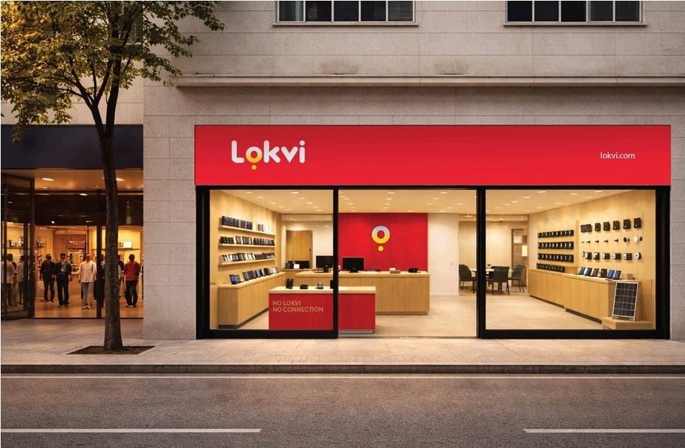
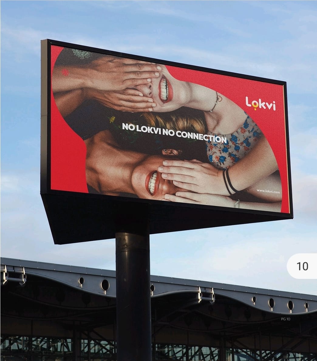
No Lokvi. No connection. A direct idea designed to make the brand present when everyday systems fail.
03
The identity
A rounded symbol, confident typography and a distinctive red, yellow and black palette create immediate recognition.
04
The system
Flexible versions for light, dark and complex backgrounds keep the identity consistent across formats.
05
The experience
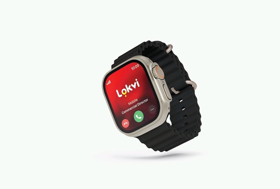
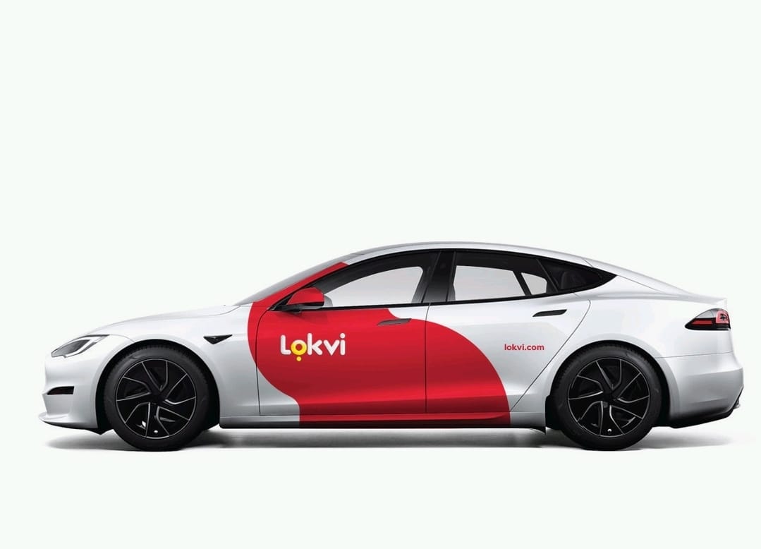
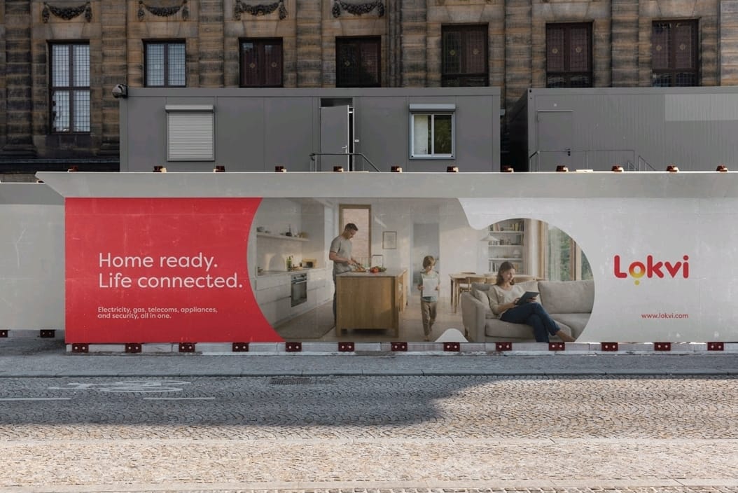
The system was explored across outdoor, retail, corporate materials, mobility, uniforms and merchandise.
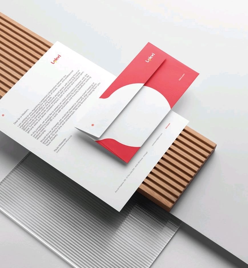
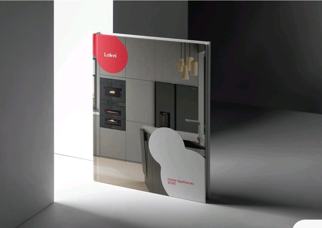
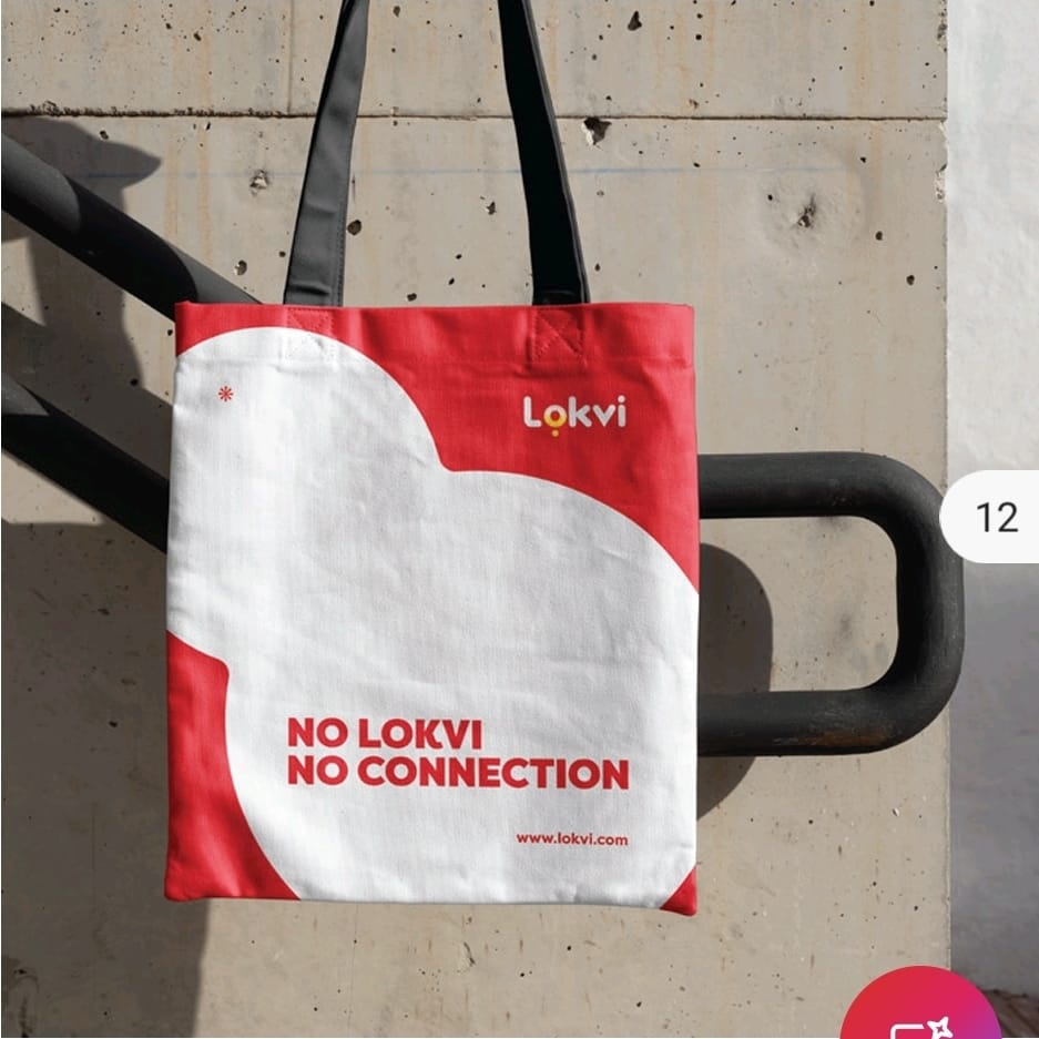
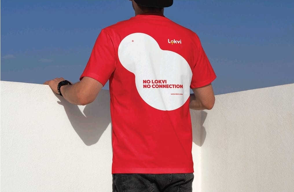
Applications shown are brand-system proposals.
06 — What we built
- 01Brand strategy
- 02Visual identity
- 03Brand system
- 04Application toolkit